After you order a long-term measurement, an account is created for you within 1-2 days.
You will receive an email (sent to the address you provided) with a link to sonotrozer.ch. Follow the link and set a new password for your account.
A second email is then sent so you can confirm your address. Once confirmed, you can sign in with your email address and the password you chose.
After signing in you land on the My Profile page. Under Measurements you will see your personal measurement campaigns (if data is already available).
This page shows your address details and the following buttons:
E-Mail
Use this button to add or change an email address. After every change a confirmation email is sent to prevent unwanted addresses. Unneeded addresses can be removed.
- My Info — edit contact data
- E-Mail — add / change address
- MFA — enable multi-factor authentication
My Info
Change contact data such as name or address. The default values equal those you provided when you rented the device. Your data is never shared and is visible only to you.MFA
Enable multi-factor authentication (e.g. Google Authenticator). For security you must re-enter your password. Scan the QR code with an app of your choice and download the ten recovery codes for safekeeping. MFA can be disabled at any time.
If you are not signed in, no personal data is available, but you can load a demo measurement by clicking the Demo button:
All analysis views are unlocked, so you can evaluate whether a long-term measurement with sonotrozer.ch suits your needs. The demo is read-only: you cannot add events or frequency groups. Help for each feature is provided in the Measurement Campaigns description.
Demo data set description:
Outdoor measurement 15 m from an air-to-water heat pump, 24 h duration, winter conditions (~1 °C) with occasional passing cars.
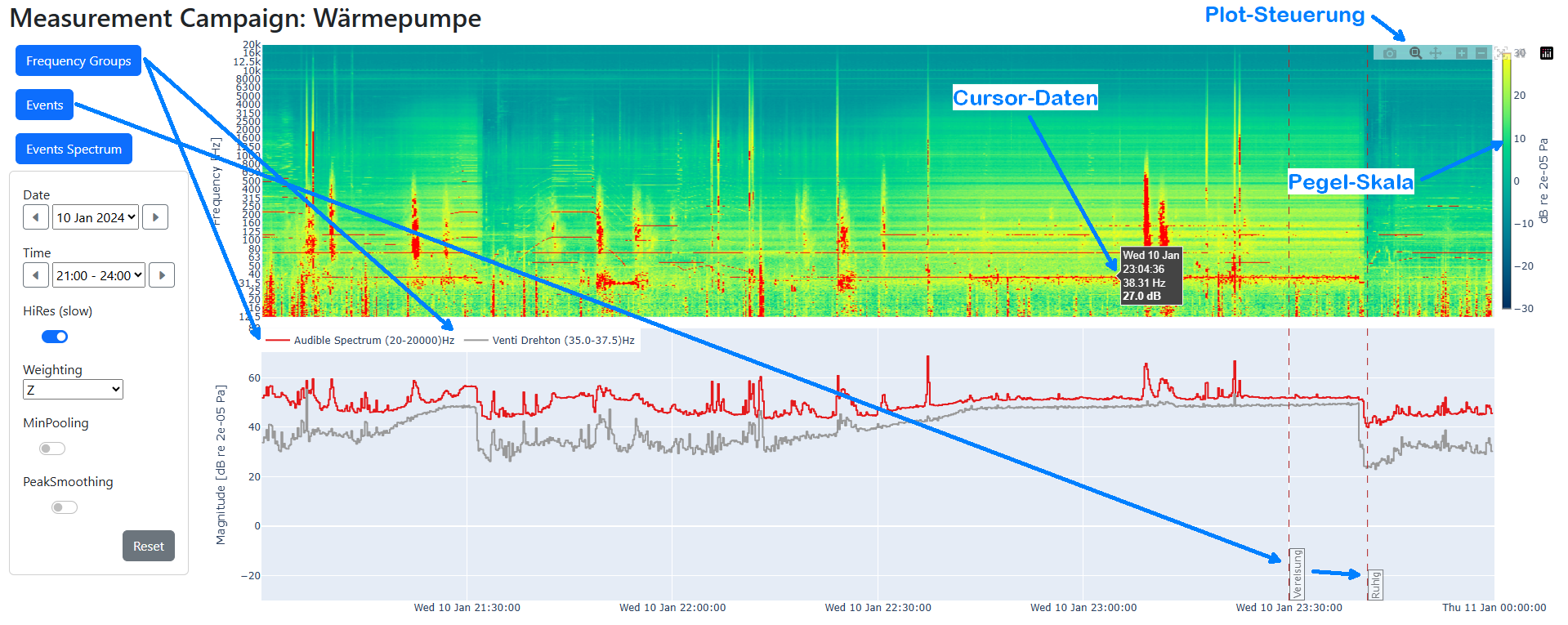
Your campaigns are listed numerically; every campaign box shows:
Click a campaign name or a day tile to open its analysis view.
Below are the level-time curves of the active frequency groups. Each group has its own colour. For clarity, show no more than five at once; click a group in the legend (at the upper edge of the level-time curves) to hide its curve.
The Evaluation graph starts in zoom mode; drag to enlarge a region. Extra controls include Pan and Autoscale. Double-clicking within the graphic will show again the complete view. Events appear as dashed vertical lines annotated with their names. Zoom actions affect both spectrogram and curves synchronously.
Z - linear (no weighting)
A - approximates 40 phon curve; standard legal metric
C - based on 80 phon curve; for loud sounds
ISO 389-7 P1 - threshold of hearing for the most sensitive 1 % of listeners
- - Name — can be edited; click to open the analysis
- - Days covered — tiles for dates with data
- - Description — optional, editable
- - Measurement Runs — all start times if the device was restarted
Click a campaign name or a day tile to open its analysis view.
Evaluation graph
The upper section shows a spectrogram (time x frequency). Colours range from dark blue (very weak) to yellow (strong). For instance, a yellow line at 40 Hz indicates a strong 40 Hz component during the highlighted period.Below are the level-time curves of the active frequency groups. Each group has its own colour. For clarity, show no more than five at once; click a group in the legend (at the upper edge of the level-time curves) to hide its curve.
The Evaluation graph starts in zoom mode; drag to enlarge a region. Extra controls include Pan and Autoscale. Double-clicking within the graphic will show again the complete view. Events appear as dashed vertical lines annotated with their names. Zoom actions affect both spectrogram and curves synchronously.
Buttons
- Frequency Groups - see the Frequency Groups section
- Events - see the Events section
- Events Spectrum - see the Events Spectrum section
Time slice and graph parameters
Date
Select the desired day via dropdown or the forward/back arrows to move one day.Time
Select any three-hour window via dropdown or the arrows to move one hour.High Resolution (slower)
The initial view uses low resolution for speed. When analysing a single day or a 3 h window, enable “High Resolution (slower)” to show more detail.Weighting
Choose a weighting curve to reflect human perception:Z - linear (no weighting)
A - approximates 40 phon curve; standard legal metric
C - based on 80 phon curve; for loud sounds
ISO 389-7 P1 - threshold of hearing for the most sensitive 1 % of listeners
PeakSmoothing
Suppresses tonal bursts shorter than 30 s, useful for machinery noise analysis.Reset
Restores the full-campaign view.
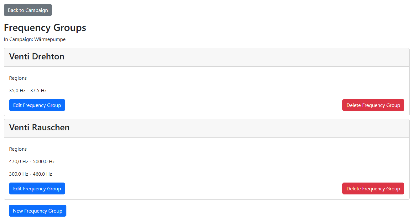
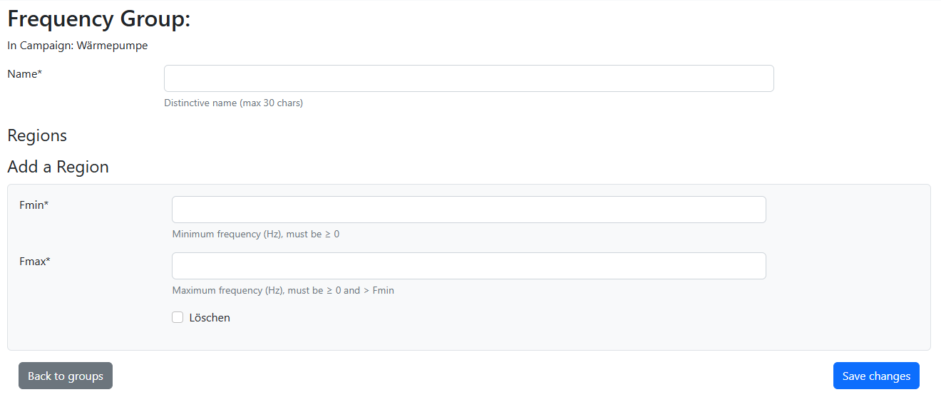
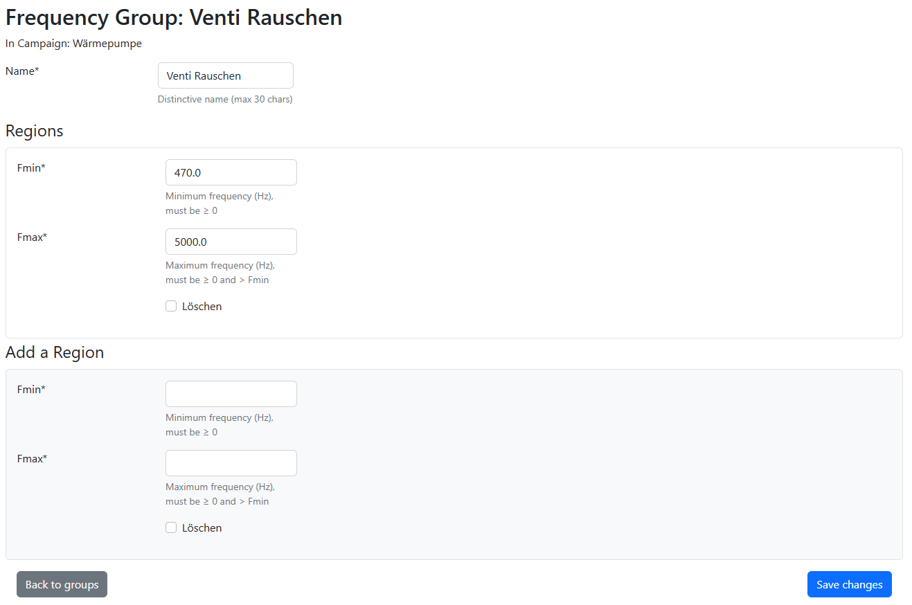
Create and edit frequency groups displayed as level-time curves. Helpful for highlighting contributions of specific sources that stand out in certain bands. A group contains one or more frequency ranges.

Initial view (no frequency group defined)
View with defined frequency groups
Add a new frequency group
Add new frequency range to existing group
Tips & tricks for frequency groups
Right-click the “Frequency Groups” button and open it in a new tab so the analysis view stays visible; after editing groups simply reload the analysis tab using the refresh button of your browser. Use zoom and the cursor to find suitable min/max frequencies. All fields marked * are required; use a dot as the decimal separator.
Add events or states (e.g. operating modes) to mark them in the Evaluation graph. Each event can optionally show its spectrum in “Events Spectrum”. An event needs at least a date/time and a name; an optional comment appears as a tooltip.
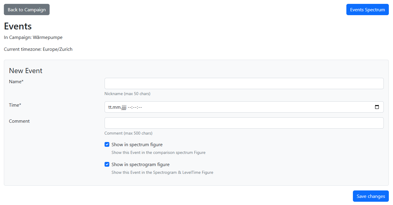
Initial view / Add a new event
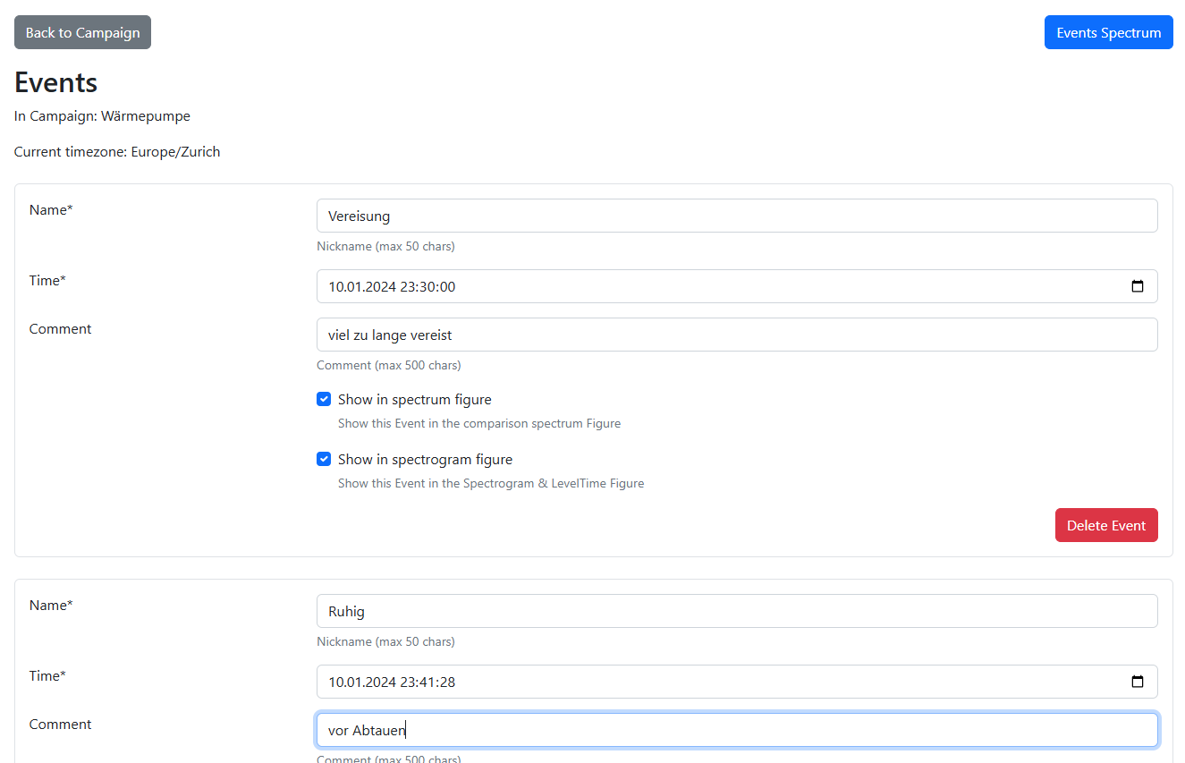
View defined events
Tips & tricks for events
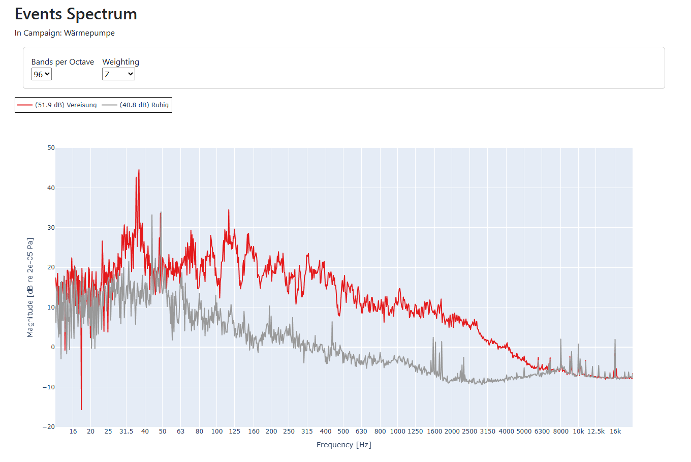
Open the “Events” button in a new tab so the analysis view remains; after editing events reload the analysis tab using the refresh button of your browser. Use zoom and the cursor to pick times. All fields marked * are mandatory. For “Events Spectrum”, enable at most five events via “Show in spectrum figure”. You can also log subjective impressions during the measurement as events and later check which contributions match the perception.Example with 96 BPO bandwidth
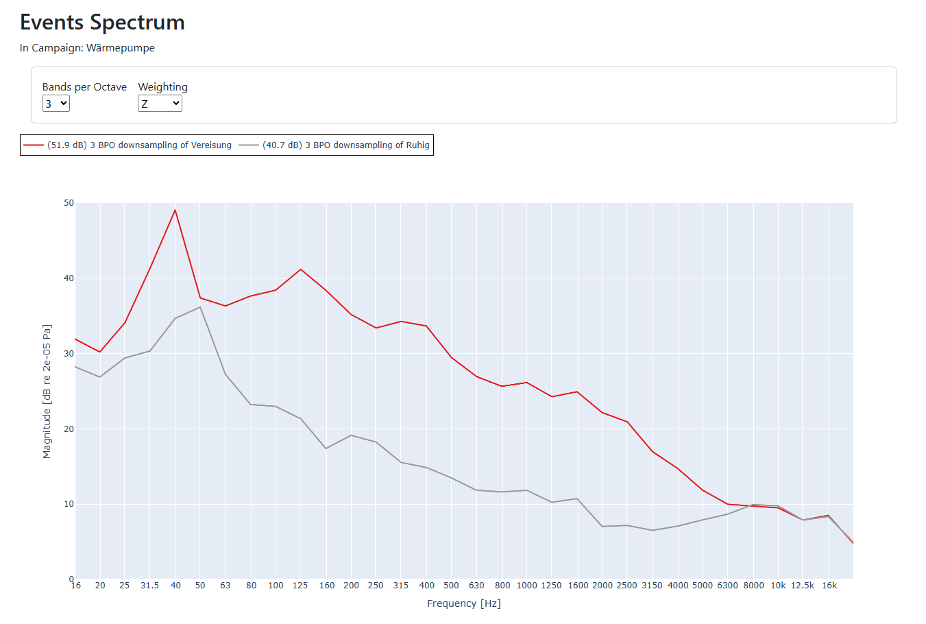
Example with 3 BPO bandwidth
Tips & tricks for Events Spectrum
Which bandwidth suits which task:1 BPO: whole octaves; shows overall energy distribution. Up to five curves compare well.
3 BPO: third-octaves; standard acoustics resolution; coarse for tones, still good overview.
12 BPO: good compromise: detail x clarity; compare up to three curves.
96 BPO: very narrow bands, high resolution; separates tones > 0.725 % apart. Compare max. two curves.
Interesting comparisons:
Quiet vs. loud phase
Background vs. operating noise
Different operating modes
Weighting: Use A-weighting to highlight frequency ranges critical for the A-weighted level.
This quick guide is also enclosed with the device.
Unboxing
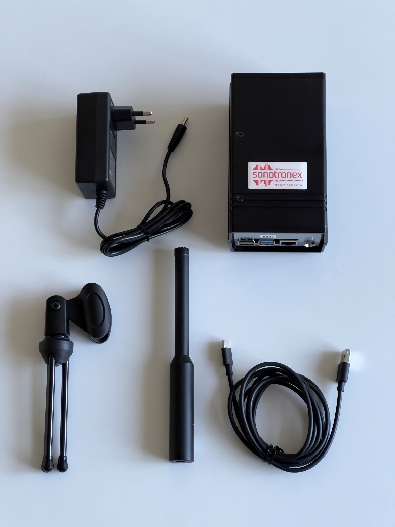 The package contains five items:
Assembling
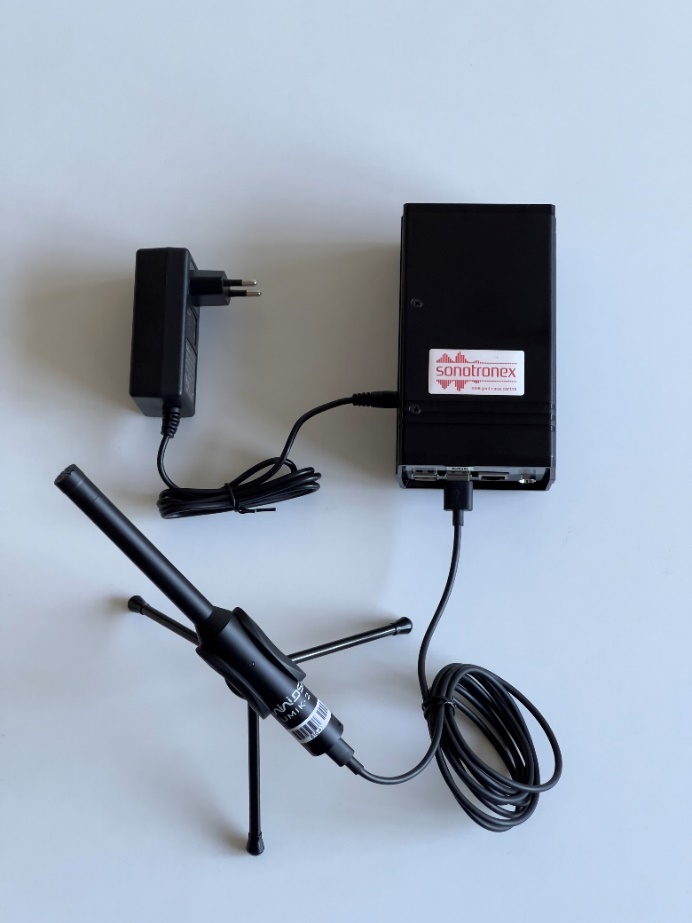
Plug the adapter into the 8.4 V jack, connect the microphone via USB-C to the port marked “Mic”, place the mic in the clip on the stand, and unfold the legs.
 Placement
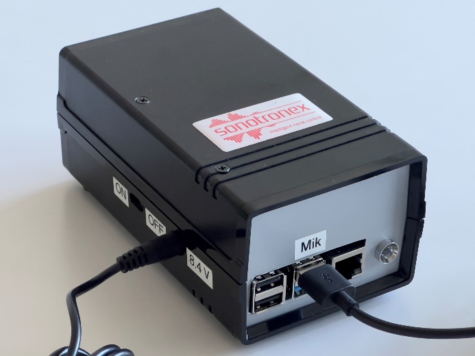
Switch the recessed ON/OFF slider to ON (use a pen if needed). Through the rear vent you should see red and green LEDs blinking faintly. After ~30 s the yellow LED on the front lights; it briefly turns off and on while the measurement runs.
Power off after the measurement
Slide the switch to OFF only while the yellow LED is lit (the device must not be saving data).
Packing & sending back
Use the original packaging and padding. Ensure parts cannot collide when shaken. Tape all seams securely and send us the tracking code so we can follow the shipment.
Further details
The internal battery keeps recording for ~3-4 h if power fails. You may pause a measurement by switching OFF and later ON again—leave the USB mic connected.
Unboxing
- The measurement device
- Power adapter
- Measurement microphone
- USB-C cable
- Microphone stand
Assembling
Plug the adapter into the 8.4 V jack, connect the microphone via USB-C to the port marked “Mic”, place the mic in the clip on the stand, and unfold the legs.
- Choose a spot where the device will not be disturbed.
- Use a mains outlet that is permanently powered.
- For the microphone pick a location without air draughts or nearby interfering sounds.
Switch the recessed ON/OFF slider to ON (use a pen if needed). Through the rear vent you should see red and green LEDs blinking faintly. After ~30 s the yellow LED on the front lights; it briefly turns off and on while the measurement runs.
Power off after the measurement
Slide the switch to OFF only while the yellow LED is lit (the device must not be saving data).
Packing & sending back
Use the original packaging and padding. Ensure parts cannot collide when shaken. Tape all seams securely and send us the tracking code so we can follow the shipment.
Further details
The internal battery keeps recording for ~3-4 h if power fails. You may pause a measurement by switching OFF and later ON again—leave the USB mic connected.
What Is Sound and How Do We Measure It?
- Sound consists of air pressure fluctuations that our ears perceive.
- This signal can be accurately measured and digitalized with a high quality calibrated measurement microphone.
- Any sound consists of multiple tonal components at varying frequencies and amplitudes.
Frequency and Human Hearing
- Frequency (Hz): The number of pressure fluctuation cycles per second.
- Humans hear from approximately 20 Hz (very low) to 20,000 Hz (very high).
- Low frequencies sound like rumbles; high frequencies sound like hisses or whistles.
Frequency Bands: Perceptual Intervals and Divisions
- Frequency bands are contiguous intervals of the frequency range.
- Humans perceive pitch logarithmically; doubling the frequency (e.g., 250 Hz → 500 Hz) sounds like an “octave” increase in pitch.
- Octave bands divide frequencies in intervals half- and double-steps apart (e.g., 63 Hz, 125 Hz, 250 Hz, 500 Hz, 1 kHz).
- 1/3-octave bands split each octave into 3 equal log-steps (present in most tools), 1/12-octave bands into 12 steps, and 1/96-octave bands into 96 steps for very fine resolution (default in our tool).
Decibel Scale & Perception
- The amplitude of pressure fluctuations are translated into a sound pressure level in decibel (dB).
- By definition, 0 dB corresponds to the reference pressure P₀ = 20 µPa (the typical threshold of human hearing at 1kHz).
- +10 dB corresponds to a tenfold increase in sound energy and is perceived roughly as twice as loud; -10 dB is perceived as half as loud.
- Because of its logarithmic nature, large pressure variations compress into manageable numbers and match more closely our perception of loudness.
Frequency Weightings
- Our ears are not equally sensitive across all frequencies.
- A-weighting (dB(A)): Mimics human hearing, attenuating low and very high frequencies.
- Z-weighting (dB(Z)): Flat response across all frequencies, for objective analysis.
The Spectrogram: A Time-Frequency Table
- A spectrogram is a visual grid showing loudness in each frequency band (rows) over time blocks (columns):
- Horizontal axis: Time
- Vertical axis: Frequency
- Colors: Bright colors = loud; dark colors = quiet.
- This way the exact time, frequency and amplitude level of a disturbance can easily be visually spotted in a measurement campaign.
Harmonic Components vs. Impulsive Noise
- Harmonic components (e.g., rotating machinery):
- The fundamental tone corresponds to rotation speed (e.g., 30 Hz at 1800 RPM).
- Overtones are often present at integer multiples (2x, 3x, etc.) and appear as parallel lines on a spectrogram.
- Impulsive noise (e.g., bangs, clicks):
- Short and broadband, showing up as vertical streaks across many frequencies on a spectrogram.
Physical Propagation: Low vs. High Frequencies
- Low frequencies (< 200 Hz) pass easily through walls/floors and produce room modes, additionally are hard to localize by the human hearing system. Low-frequency disturbances are often the main cause for discomfort inside buildings, so inspecting bands below 200 Hz first is good practice.
- High frequencies (> 2 kHz) are way more easily absorbed by building materials and obstacles, therefore less likely to carry over long ranges. They are easier to locate by ear.
For further learning, see HyperPhysics: Sound Concepts.